Choosing calm colors for your home can make rooms feel more comfortable, balanced, and inviting. Soft colors may help a space feel open and peaceful, while warm neutrals can create a sense of comfort. The best choices depend on your room’s natural light, size, furniture, and the mood you want to create.
You do not need to use only white, beige, or pale blue to create a calm interior. Many colors can feel relaxing when they are soft, muted, or thoughtfully combined. Use the following tips to find a palette that suits your home and personal style.
Start With the Mood You Want
Before choosing paint or accessories, think about how you want the room to feel. A bedroom may benefit from colors that feel quiet and restful, while a living room may need a little more warmth and character.
Consider these general color moods:
– Soft blues: Often create a cool, airy, and peaceful feeling.
– Gentle greens: Bring to mind nature and can make a room feel fresh.
– Warm neutrals: Add comfort without making the space feel busy.
– Muted pinks: Offer softness and warmth when used in subtle shades.
– Light grays: Provide a clean, simple background for furniture and artwork.
– Earth tones: Create a grounded and natural atmosphere.
Look for descriptive words that match your goal, such as peaceful, cozy, fresh, light, natural, or welcoming. These words can guide your choices and help you avoid colors that feel too bright or intense.
Pay Attention to Natural Light
Light can change the way a color looks throughout the day. A shade that appears soft in a store may look much brighter or darker on your wall.
Rooms with plenty of natural light can usually handle cooler colors, such as pale blue, soft green, or light gray. If a room receives limited sunlight, warm neutrals, creamy whites, or gentle beige tones may help it feel more inviting.
The direction of your windows also affects color:
– North-facing rooms often receive cooler, softer light. Warm colors can help balance the effect.
– South-facing rooms usually receive stronger, warmer light. Cooler or neutral shades may feel more balanced.
– East-facing rooms are brightest in the morning and may look warmer early in the day.
– West-facing rooms receive stronger afternoon and evening light, which can make warm colors appear more intense.
Test paint samples on more than one wall, and check them at different times. This simple step can prevent surprises after painting.
Choose Muted Shades Over Very Bright Colors
Calm colors are not always pale. The key is often choosing a shade that has a softened, dusty, or gray undertone instead of a highly vivid appearance.
For example, a bright green may feel energetic, while a muted sage green can feel more restful. A strong blue may draw attention, while a smoky blue can create a quieter backdrop.
When comparing samples, look for colors that appear:
– Soft rather than sharp
– Slightly gray or earthy
– Gentle in both bright and dim light
– Easy to pair with your existing furnishings
If you love a bold color, consider using a softer version on the walls and saving the stronger shade for small accents, such as pillows, artwork, or a decorative chair.
Build a Simple Color Palette
A calm room usually feels more comfortable when its colors are connected. Instead of choosing many unrelated shades, create a simple palette with three levels:
- **Main color:** The dominant wall, floor, or large furniture color.
- **Supporting color:** A second shade used for curtains, rugs, or upholstery.
- **Accent color:** A small amount of contrast added through accessories.
A common approach is the 60-30-10 method. About 60 percent of the room uses the main color, 30 percent uses a supporting color, and 10 percent uses an accent. This does not need to be exact, but it can help keep the room balanced.
For example, a living room might include warm white walls, a soft green sofa or rug, and small touches of muted terracotta. The colors feel varied without competing for attention.
Use Neutrals With Care
Neutrals are a popular choice for calm interiors, but not every neutral creates the same effect. Bright white can feel clean and spacious, while a creamy white can feel softer and warmer. Gray can appear modern and quiet, but some cool grays may feel stark in rooms with limited light.
When choosing a neutral, compare it with the other surfaces in the room. Floors, cabinets, countertops, and furniture can all influence how the color appears.
You may also want to layer several related neutrals rather than using one shade everywhere. For example, combine an off-white wall with a light beige rug and medium tan wood furniture. The subtle differences add depth while maintaining a peaceful look.
Consider the Size and Purpose of the Room
Color can influence how large or intimate a space feels. Lighter shades often make small rooms feel more open, while medium and deeper shades can make large rooms feel cozier.
For small rooms, consider:
– Pale blue, green, or warm white walls
– Light-colored curtains
– Minimal contrast between walls and trim
– Reflective surfaces that help spread light
For large rooms, consider:
– Warm, muted colors to add comfort
– Deeper shades on one wall
– Layered rugs and textiles
– Coordinated colors that visually connect separate areas
The room’s purpose matters, too. A home office may benefit from a soft green or warm gray, while a dining room can support a richer neutral or muted clay shade.
Coordinate With Existing Features
Paint does not need to be chosen in isolation. Look at the items that will remain in the room, including flooring, cabinets, furniture, artwork, and window treatments.
If your furniture has warm wood tones, warm whites, sand, beige, or muted green may work well. If your room includes cool metal finishes or blue-gray furniture, soft gray, pale blue, or gentle lavender may create a more connected look.
Choose one or two existing items that you want to highlight, then select colors that support them. This approach is often easier than starting with an empty color chart.
Add Calm Through Texture and Contrast
Color is only one part of a peaceful room. Texture can keep a soft palette from feeling flat or plain. Add interest with woven baskets, linen curtains, wool rugs, wood accents, or natural stone details.
Gentle contrast is also useful. A room made entirely of pale colors may feel unfinished, while small darker elements can provide structure. Try adding:
– Medium wood furniture
– Charcoal picture frames
– A deep green plant
– A patterned cushion with related colors
– Matte black or bronze hardware
Keep contrast limited and intentional. A few grounding details can make the overall palette feel more complete.
Test Before You Commit
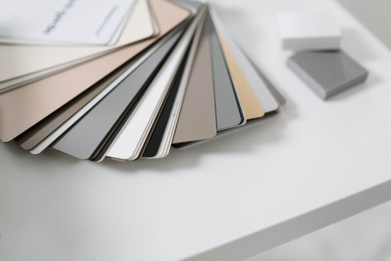
Always test your favorite colors before buying enough paint for the entire room. Paint large sample areas or use removable sample boards. Observe them during morning, afternoon, and evening light.
Place samples near trim, flooring, and furniture to see how they interact. If a color feels too strong, try a lighter or more muted version. If it feels cold, compare it with a warmer option.
Choosing calm colors is a process of looking, comparing, and adjusting. By considering light, mood, existing features, and color balance, you can create rooms that feel comfortable and personal. Start with a few carefully selected samples, and let the final palette develop naturally.